
About the Screen Resolution Checker
This free screen resolution checker reports everything about the display you are using right now — resolution, browser window size, pixel ratio, colour depth and orientation. Nothing to click: the report is there the moment the page opens.
It answers the question that comes up whenever something looks wrong on a screen: what exactly is this display, and what size is the browser actually rendering at?
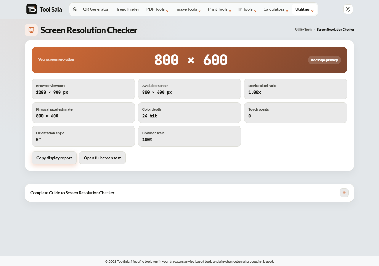
What the report shows
- Screen resolution — the full size of your display in pixels.
- Viewport size — the area your browser actually has for the page, after toolbars and scrollbars.
- Device pixel ratio — how many physical pixels make up one CSS pixel. 1 on an ordinary monitor, 2 or 3 on a high-density phone or Retina screen.
- Colour depth — bits per pixel, normally 24 or 30.
- Orientation — portrait or landscape.
Use Copy display report to paste everything into a support ticket, and Open fullscreen test to see the display with no browser interface at all.
Resolution vs viewport — the one that confuses everyone
These two numbers are almost never the same, and that is normal.
Your screen might report 1920 × 1080 while the viewport is 1920 × 937 — the missing height is the browser’s toolbar and tabs. On a phone the gap is bigger still, because the address bar and system bars take real space.
When you design or test a website, the viewport is the number that matters. That is the space your page actually gets.
Why device pixel ratio matters
A modern phone may report a 390-pixel-wide viewport while physically having 1170 pixels across — a ratio of 3. That is why an image that looks crisp on a desktop can look soft on a phone: the phone is stretching it across three times as many real pixels.
The practical rule for web images: supply them at roughly twice the display size you need, so they stay sharp on high-density screens.
Screen Resolution Checker FAQs
Is this tool free?
Yes. No signup, and nothing to install.
Is any data sent to a server?
No. Everything is read from your own browser and displayed locally.
Why is the viewport smaller than my screen resolution?
Browser toolbars, tabs and scrollbars take space, and on a phone so do the system bars. The viewport is what remains for the page.
What is a good device pixel ratio?
There is no good or bad — it describes your hardware. 1 is a standard monitor, 2 or 3 is a high-density phone or Retina display.
Does the report change if I resize the window?
The viewport does, because it measures the browser window. The screen resolution stays the same.
How do I test a website at a different size?
Use the website screenshot tool to capture any site at desktop, laptop, tablet or mobile width.
Related online tools
- Website Screenshot — capture a site at any device width.
- Photo Editor — resize images for high-density screens.
- Image Compressor — shrink images without losing sharpness.
- All utility tools — the full list.